

Thank you for joining us for another of Jac’s reviews!
Today I’m reviewing the Tarot Art Nouveau, illustrated by Antonella Castelli. She was able to draw inspiration from the classic design of tarot to develop a flow of color that washes throughout her images. She keeps the focus primarily on human figure and their emotions in this deck.
I’m struck by the soft coloring contrasted with bold outlines to create a feel of watercolor that bleeds through every picture. Some of them are difficult to draw meaning from, however, even if you are familiar with tarot. While many reflect their inspiration from the classic design, others are too ambiguous to attach a clear explanation.
The Devil and the Two of Cups, for example, are clearly new creative visions of the cards. Far removed from Smith’s symbolism, these images still express the intent of tarot schema upon which concepts are built. The Devil looks devious, yet alluring, and the 2 of Cups shows a deeply close relationship.
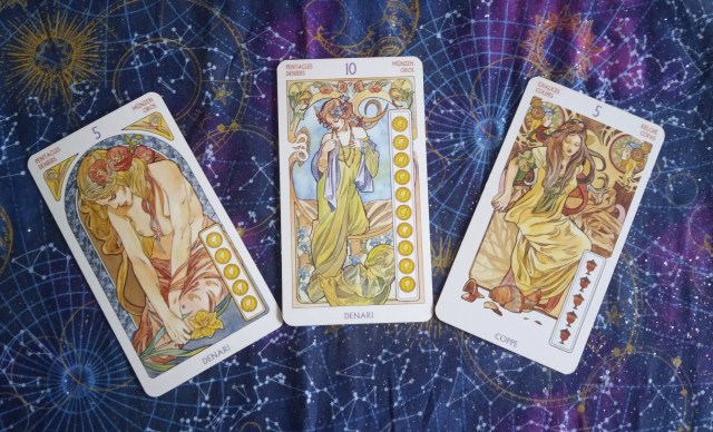
In contrast, however, we have the Five of Chalices and Coins along with the Ten of Coins. Fives normally express hardship and loss in their extremes, where these women seem a bit downcast there’s nothing to suggest pain or despair. The joy and fulfillment of success is absent from the 10 of Cups, as well. She looks rather blasé instead of even expressing subtle emotions, like pride or contentment.
It is a Lo Scarabeo deck. These offer a multilingual review of the card meanings and a basic layout for readings in its manual. Additionally, every card has its name written in the corners so many people can use them. While all tarot readings should have a variety of interpretations, I’m amused by the more literal approach. The small booklet itself also provides a generally adequate explanation of what each card represents.

The full size deck and the mini deck both have a gloss finish which makes them slick to slide well across themselves for swirl shuffling. The card stock is comfortably thick, so I don’t feel as though I’m damaging them with every use. The back of the standard size deck has a bilateral image of The Fool, while the mini has a unilateral framing of Justice. The color seems a gentle wash in its larger form, rather than bold splashing in miniature.
The Art Nouveau style has always clashed with industrial design in favor of a organically inspired creation. The lines curve and flow, often blending nature and humanity. Within this deck you can feel the style held constantly. It does seem like the focus was more about illustrate a beautiful form over being able to express meaning behind the deck. Regardless, I don’t find it to detract from the cards usability and it’s a deck I have made great use of.
Like the look of this deck and want to try it for yourself? Click the links below to purchase!
Share this article on Pinterest with the image below!

